PRODUCT
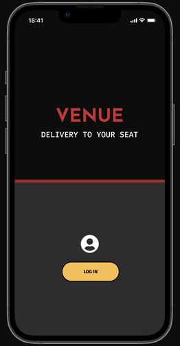
VENUE is designed for an iconic, arena size music venue outside of a major metropolitan area in the US. The venue hosts major events with over 10,000 attendees and caters mostly to top-tier music acts.
PROJECT DURATION: February - April 2022
PROJECT DURATION: February - April 2022
PROBLEM |
GOAL |
|
Concertgoers spend too much time away from the performance getting food and drinks. The public areas of the venue become crowded, resulting in safety hazards.
MY ROLE: UX designer and researcher, designing the VENUE app from concept to delivery. |
Design an app that allows patrons to order food and drinks to be delivered to their seats.
RESPONSIBILITIES: Conducting user interviews, paper and digital wireframing, low and high-fidelity prototyping, conducting usability studies, accounting for accessibility, and iterating on designs. |
USER RESEARCH
I conducted interviews with venue management to discover pain points to alleviate through the app’s design. Because VENUE is a hypothetical product, I interviewed a colleague in the venue operations field. I conducted user interviews with audience members to uncover unmet needs while attending concerts. I identified a primary user group of concertgoers attending concerts with groups of friends between four and eight people.
This group confirmed initial assumptions about audience members, but research also revealed a desire to order food and drinks for delivery as a group.
This group confirmed initial assumptions about audience members, but research also revealed a desire to order food and drinks for delivery as a group.
PAIN POINTS
|
TIME
Going to purchase food and drinks from a vendor takes audience members away from the show for too long. |
CROWDED SPACES
For the venue, having many audience members in the public areas of the venue is a safety hazard. |
REDUCED SALES
The venue found that some concertgoers chose not to make purchases to avoid leaving the concert. |
STARTING THE DESIGN
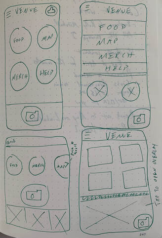
Taking the time to draft iterations of each screen of the app on paper ensured that the elements that made it to digital wireframes would be well-suited to address user pain points. For the home screen, I prioritized a quick and easy ordering process to help users save time.
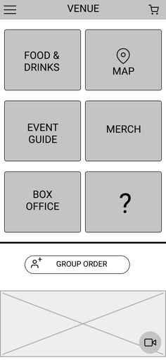
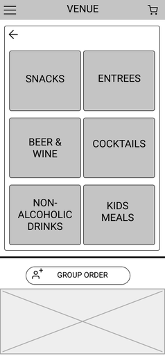
DIGITAL WIREFRAMES
|
|
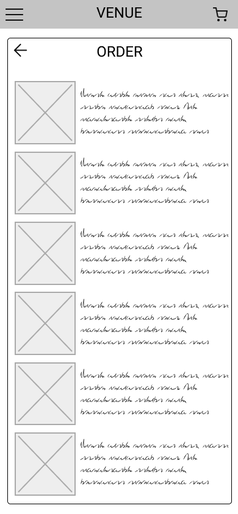
|
As the initial design phase continued, I made sure to base screen designs on feedback and findings from the user research. Users wanted an easy way to navigate the large venue, and a way to order exclusive merchandise to be sent to their homes.
USABILITY STUDIES
|
ROUND 1 FINDINGS
1. Users want a way to separate a group order 2. Users need clear order confirmation 3. Users wanted more detailed information on menu items. |
ROUND 2 FINDINGS
1. Users wanted to see menu prices earlier in the flow. 2. Users want more options for adding people to a group order. |
MOCKUPS

|
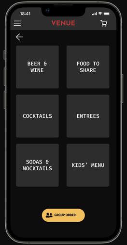
|
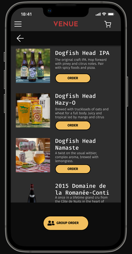
|
SCREEN FLOW
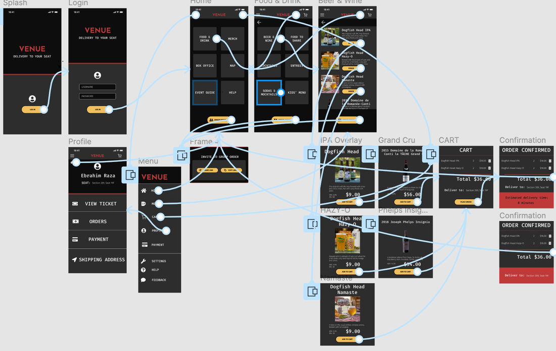
The final high-fidelity prototype presented a clean flow for ordering beverages and checkout. It also met user needs for more information about menu items and pricing.
HIGH FIDELITY PROTOTYPE
